I’ve discovered that table mats do more than protect your surfaces; they’re your dining room’s foundation for style and function. Whether you’re drawn to layered textures, bold colors, or personalized touches, the right mats can completely reshape how your table feels and works.
The key is matching your choices to both your space and your lifestyle. Here’s how to create mats that reflect what matters to you, not just practical add-ons.
Assess Your Space and Style Before Choosing Materials

How can you pick the perfect placemat when there are so many options out there? Start by examining your dining area’s layout and existing décor. Notice your table’s shape: rectangular placemats work wonderfully on longer surfaces, while round tables call for different designs.
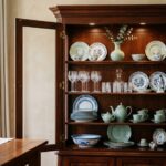
Next, identify your room style. Does it feel rustic, modern, classic, minimalist, or boho? This guides your material selection. Jute brings warmth to casual spaces, linen offers elegance, acrylic provides easy maintenance, and Capiz creates sophisticated charm.
Consider your color palette and lighting. Choose placemat colors that harmonize with your tableware or create intentional contrast.
Finally, think practically. Do you need stain resistance for frequent family dinners? Evaluate maintenance requirements based on your lifestyle. When you align these elements, you’ll find placemats that truly suit your dining experience and feel right for your home.
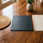
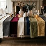
Layer Textures in Your Table Mats for Visual Interest

I’ll show you how combining different materials, like pairing a smooth linen runner over a textured jute base mat, creates rich depth that makes your table feel carefully planned and refined. You can mix tactile elements like burlap, crocheted overlays, or cotton with rougher materials to build what designers call “dimensional richness,” which simply means your mats feel interesting to look at and touch.
The key is choosing mixed material combinations that work together without clashing, so your table looks thoughtfully designed rather than randomly layered.
Mixed Material Combinations
Why settle for a single texture when you can layer them for visual depth? Mixed material table mats combine complementary textures to create an elegant, dynamic dining experience that feels both luxurious and inviting.
Consider pairing leather with linen for a sophisticated look, or cork with woven vinyl for casual charm. These texture pairings balance smooth surfaces against tactile fabrics, adding visual interest while serving practical purposes. I’ve found that alternating matte and glossy finishes prevents visual heaviness, keeping your table feeling fresh.
The real beauty is that mixed materials deliver functional benefits too. They offer superior heat resistance, non-slip stability, and easier maintenance. A durable base material paired with a wipe-clean top layer means you’re protecting your investment while enjoying gorgeous aesthetics.
Tactile Depth and Dimension
Texture is your hidden asset for creating depth in a placemat that catches both your eye and your fingertips. Layering different materials creates tactile depth you’ll actually feel during meals. Woven placemats paired with silicone backings, jute bases topped with linen, or leather accents give you textural variety that enhances your table instantly.
| Material | Feel | Best For |
|---|---|---|
| Jute | Coarse, natural | Rustic setups |
| Linen | Soft, refined | Elegant dinners |
| Woven vinyl | Smooth, durable | Everyday use |
Natural materials combined with easy-care fabrics mean you’re choosing both beauty and practicality. Non-slip backings keep everything stable while dampening noise.
This tactile dimension reinforces seasonal themes: soft textures for winter, coarse weaves for summer gatherings. You’re creating an immersive dining experience that feels as luxurious as it looks.
Textural Contrast Strategies
When you layer different textures on your table, you’re creating visual interest that makes your dining setup feel well-planned and refined. I recommend starting with a woven placemat as your base, then adding a smooth linen runner or glossy leather mat on top. This combination creates tactile contrast that invites touch and makes your dining table special.
You can also mix material families, such as jute, cork, and fabric, to catch light differently across your table surface. Try varying textile textures within the same color family, like neutral beige jute paired with cream cotton and taupe linen. This keeps everything cohesive while building depth.
Don’t forget practical details: choose mats with different weaves like canvas or herringbone, and always prioritize non-slip backings. These ensure stability while showcasing those luxurious mixed materials you’ve carefully selected.
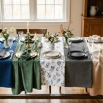
Pick Colors That Harmonize With Your Table

I’ve found that choosing the right colors for your table mats is important in creating a dining space that feels purposeful and elegant. You can go two directions: analogous color harmony, which pairs similar hues like soft greens with earthy browns for a calm, unified look, or complementary contrast pairings, like orange placemats with blue tableware, which create vibrant energy and visual excitement.
The key is matching your color choice to the mood you want. Select serene and luxurious tones, or choose lively and dynamic ones instead.
Analogous Color Harmony
How’d you like to create a dining space that feels inherently well-designed, like everything belongs in the same room?
Analogous color harmony does exactly that. I’m talking about selecting placemats and tableware in colors sitting next to each other on the color wheel: think soft greens paired with earthy browns or golden yellows blending into warm oranges.
Here’s why this works: when you use a harmonious dining color palette of three adjacent hues, you build depth while keeping things calm and unified. Your space feels deliberate, garden-inspired, and luxurious without trying too hard.
Start by choosing one dominant color for your placemats, then layer neighboring tones through your tableware and accessories. Keep harmonious patterns within that color family to avoid visual clashes.
This approach creates an elegant, seamless sanctuary at your table where guests genuinely feel they belong.
Complementary Contrast Pairings
If you’re ready to make your dining space pop with energy, complementary color pairings deliver exactly that kind of vibrant impact. I find that placing colors opposite each other on the color wheel creates bold, luxurious contrast that changes your dining room decor instantly.
Consider an orange placemat paired with blue tableware. This lively combination draws immediate attention to your place setting. The visual energy feels elegant yet dynamic, making dinner feel special.
These vibrant high-contrast pairings work because they’re naturally balanced. Your eyes enjoy the excitement without feeling overwhelmed. When you select complementary color pairings, you’re choosing professional design principles that designers use in upscale restaurants.
Start with one complementary pairing and build from there. You’ll discover how these colors make your tableware shine while creating a memorable dining atmosphere your guests will notice.
Blend Patterns (Floral, Geometric, Abstract) Without Clashing

Why do some tables feel harmonious while others look chaotic? I’ve found the answer lies in blending patterns thoughtfully. When you pair floral patterns with geometric patterns in matching color tones—think blues and greens together—you create contrasting combinations that feel deliberate and well-planned. I vary pattern scales strategically, pairing small florals with large geometric designs to build visual interest without overwhelming the eye.
The key is mixing patterns from the same design family, like botanical florals with leaf motifs, rather than completely opposite styles. I anchor everything with solid tableware that lets each mat design shine clearly. By alternating placement sizes, one large patterned mat beside smaller ones, I establish an elegant rhythm. This approach creates a sophisticated, balanced table setting where every element belongs together beautifully.
Personalize With Initials, Dates, and Meaningful Quotes

When you add your family’s initials or a special date to your placemats, you’re creating personalized keepsakes that tell your family’s story. This approach creates conversation starters and strengthens your dining experience.
Consider these personalization options:
- Initials with monogram design – Combine family initials with subtle icons like botanical motifs to keep the look elegant and readable across the table
- Meaningful dates – Embroider anniversaries or birth years as tactile memory cues that anchor meaningful conversations during meals
- Inspirational quotes – Choose favorite sayings that fit your mat’s size and complement your customized dining decor theme
These customized placemats work beautifully as thoughtful gifts too, commemorating relationships and milestones. When guests see their personalized settings, they’ll feel like they truly belong at your table.
Match Materials to Your Lifestyle: Everyday vs. Entertaining

The right placemat material significantly impacts how much you’ll actually enjoy using them. For everyday durability, I choose woven vinyl, silicone, or polyester blends that resist spills and frequent washing. Non-slip backing keeps them anchored during rushed family meals, while stain resistance means I’m not stressing over accidents.
When I’m entertaining, though, I embrace luxury fabrics like linen or hand-block printed cotton that enhance my table instantly. These entertaining textures and bold patterns create conversation starters, though they demand gentler care.
I’ve discovered that seasonal versatility matters too. Jute, cork, or bamboo mats bridge both worlds; they’re practical enough for daily use yet elegant enough to impress guests. Matching materials to your actual lifestyle means you’ll reach for placemats confidently, every single meal.
Refresh Seasonally to Keep Your Table Intentional

Once you’ve settled on the right materials for your lifestyle, I’d encourage you to think beyond picking one set and sticking with it forever. Seasonal placemats keep your dining space looking current throughout the year. Consider these rotating strategies:
- Spring florals paired with linen, Summer beach-inspired styles with light textures, and Autumn warm tones with earthy weaves
- Color momentum and pattern scale that coordinate with your existing dinnerware without clashing
- Coordinating textures, runners, napkins, and centerpieces for a unified tablescape
Each seasonal rotation brings visual interest while supporting your table’s overall design story. Lighter fabrics in warmer months require gentle washing, while winter textures need extra care.
This thoughtful approach to maintenance and seasonal change creates an elegant dining experience that reflects the beauty of each season.