Your dining room’s paint color sets the entire mood for meals and gatherings, yet choosing the right shade can feel overwhelming. I’ve found that the perfect color doesn’t just look good; it actually changes how you feel in the space.
Whether you’re drawn to calming greens, sophisticated blues, or warm terracottas, each option brings distinct benefits to your table. Let’s explore five paint colors that’ll help you create the dining room you’ve always wanted.
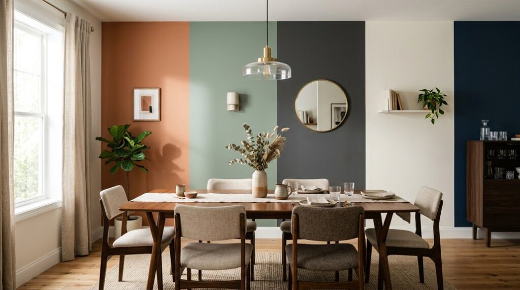
Soft Sage Green for Dining Rooms: Create Calm and Natural Connection

Why do so many designers reach for soft sage green when they’re creating a dining room that feels both welcoming and sophisticated? I’ve discovered that this calming color creates an organic feel that connects your space to nature beautifully.
When you paint your dining room wall with soft sage green, you’re establishing a serene dining atmosphere perfect for lingering conversations and memorable meals. This sage green backdrop pairs wonderfully with warm wood tones, natural textures like woven fabrics, and brass accents.
The beauty lies in its versatility; it works across different decor styles, adapting seamlessly to casual dinners or elegant gatherings. I find that earthy accents and botanical elements reinforce the natural connection, making your dining room a soothing retreat where everyone feels they truly belong.
Classic Navy Blue: A Sophisticated Paint Color for Dining Spaces

When you’re ready to create a dining room that feels truly elegant and timeless, classic navy blue deserves your serious consideration. This deep tone establishes a sophisticated mood that welcomes gatherings and conversation. Navy works beautifully with wood furniture, creating natural contrast and warmth in your space.
I recommend using navy as an accent wall rather than painting all four walls, which prevents the room from feeling too dark or overwhelming. Pair this classic paint color with lighter furnishings and fixtures to balance the deep tones. The result is a luxurious dining room that feels both commanding and inviting.
Navy blue’s versatility means it complements various design styles, from traditional to contemporary. This refined choice creates a dining space where you’ll genuinely want to linger with loved ones.
Warm Terracotta Dining Room Color: Mediterranean Comfort

If you’re drawn to warmth and earthiness rather than deep, cool tones, warm terracotta offers a completely different personality for your dining space. I find this Mediterranean-inspired color creates a welcoming, inviting atmosphere that feels like home.
Terracotta pairs beautifully with warm wood tones and natural materials, establishing a unified color palette. I recommend layering textured fabrics like woven drapery and stone accents to add depth and elegance.
Incorporate greenery through potted plants; it reinforces that homey feeling while bringing life to your room. Balance your terracotta walls with earthy neutrals and warm trims to maintain harmony throughout. This approach creates a luxurious yet approachable dining environment perfect for farmhouse or rustic styles. You’ll appreciate how this color invites gatherings and conversation, making your dining room a welcoming place to spend time.
Muted Blush Pink: A Romantic Dining Room Paint Choice

Perhaps you’re looking for a color that whispers elegance rather than shouts it. Muted blush pink delivers exactly that kind of subtle sophistication. This romantic dining room paint creates an intimate atmosphere that welcomes guests without overwhelming the space.
Muted blush pink whispers elegance, creating intimate dining atmospheres that welcome guests without overwhelming the space.
Here’s what makes this versatile color work:
- Pairs beautifully with warm woods and neutral upholstery, creating a refined look with purposeful design choices
- Combines with soft lighting to enhance the intimate atmosphere, letting you control the room’s warmth and mood throughout dinner
- Works as both wall color and accessory complement, maintaining flexibility across casual and formal decor schemes
This muted blush pink offers something special: romantic charm without dominating your dining room. When paired thoughtfully with your existing furnishings and lighting, you’ll create a welcoming ambiance that invites people to linger longer at the table.
Creamy White Paint: The Versatile Dining Room Backdrop

While muted blush pink brings romantic warmth to a dining room, creamy white offers something equally powerful: a bright, welcoming backdrop that works with nearly any style you love. I find that this versatile backdrop prevents your walls from feeling stark or cold. Instead, its warm undertone creates an inviting atmosphere perfect for gathering.
Creamy White pairs beautifully with wood finishes and supports two-toned walls for visual interest. Your linens and artwork truly pop against this neutral canvas, letting bold decor accents shine. Whether you’re designing an interior or exterior dining space, this color adapts effortlessly to different aesthetics.
Consider pairing Creamy White with Linen Wash on trim, Green Stone on walls, and Flint on the ceiling. This combination creates an elegant, well-coordinated look that feels both sophisticated and welcoming to everyone at your table.