Picture a dining room wall that tells your story, one where frames of varying sizes create visual rhythm and your favorite artwork becomes the room’s elegant anchor. I want to help you create a gallery that feels purposeful and refined, not random.
The key is balancing formal structure with creative arrangement. I’m here to show you exactly how to do it. Let me walk you through the techniques that designers use to make picture walls work beautifully.
Grid Layouts for Formal Dining Rooms: The Polished Foundation

How do you create a dining room that feels both organized and sophisticated? Grid layouts offer the answer. I’ve found that crisp grids, like 2×3, 3×3, or 4×3 arrangements, make your dining room gallery a polished foundation for elegant entertaining.
The secret lies in centering your grid around a focal piece and maintaining equal spacing between frames. When positioning your dining room gallery above a buffet or console, I recommend centering it 57–60 inches from the floor. This height creates a natural sightline that draws guests’ eyes effortlessly.
To unify your gallery walls, use consistent frame finishes throughout. This approach harmonizes different artwork sizes beautifully. Coordinate your lighting, especially your chandelier, to enhance the formal impact while preventing glare on glossy surfaces. These thoughtful touches will help your formal dining rooms feel intentionally designed, inviting, and refined.
Salon-Style Clusters: Creating an Organic, Collected Look

I’ll show you how to build a salon-style cluster that feels naturally curated rather than rigidly planned. It starts with embracing variation in your frame sizes, orientations, and spacing.
You’ll want to mix different dimensions (think small square frames next to larger rectangular ones) and angles to create that lived-in quality, while keeping pieces anchored by an invisible center point so they read as one intentional composition. This approach works beautifully because it balances the organic feel of asymmetry with the visual harmony that comes from consistent spacing cues and a unified color palette.
Organic Frame Size Variation
When you’re ready to move beyond rigid grids and embrace a more relaxed approach, salon-style clusters offer the perfect solution for displaying your dining room artwork. Frame size variation is key: mixing large statement pieces with smaller frames creates visual rhythm and prevents monotony across your gallery wall.
I recommend combining oversized prints with medium and petite frames in an organic layout that feels deliberately arranged rather than randomly placed. This approach allows you to showcase different dining room art styles while maintaining visual balance. Vary your frame orientations too, with some horizontal and some vertical, to enhance the collected feel.
Anchor your arrangement with one prominent piece, then build outward with complementary sizes. This frame size variation creates an elegant, inviting display that tells your unique story.
Asymmetrical Spacing and Balance
Once you’ve mastered frame size variation, the real magic happens when you arrange those pieces with intentionally uneven spacing. That’s where salon-style clusters truly shine. I recommend starting with a loose center axis, then building outward asymmetrically. This gallery wall approach feels collected and lived-in, not rigid.
The key is maintaining inconsistent but balanced vertical and horizontal gaps. You’re creating intentional breathing room, not random placement. Group related themes or colors together for cohesion while preserving that eclectic feel.
Here’s what ties everything together: a unifying element like matching frame finishes or matting styles. This cohesive unifier anchors your framing variety, giving disparate pieces elegant harmony. The result is an asymmetrical spacing arrangement that feels deliberately assembled, inviting guests into your personal story.
Collected Art Arrangement Techniques
How do you create a wall that looks like you’ve gathered treasures over years rather than following a decorator’s blueprint? You build a salon-style gallery wall with intention and personality.
Start with one anchor piece, perhaps a larger frame or elegant mirror, then layer mixed frames around it. Vary sizes, orientations, and finishes: gold, wood, black metal. Space pieces roughly two to three inches apart, maintaining consistent gaps while staggering heights.
Add texture by interspersing non-traditional elements like decorative plates or wall sculptures between artwork. This clustered arrangement feels collected, not planned.
Use a cohesive color story or shared finish to unify your mixed frames, creating harmony amid variety. Your dining room wall becomes a personal gallery reflecting your style and story, inviting guests to linger and connect.
How to Space and Proportion Your Wall Art: The Technical Rules

Why does a perfectly arranged gallery wall sometimes look polished while another feels chaotic? The answer lies in mastering spacing and proportion: the technical rules that organize random frames into an elegant display.
I’ve found that centering your composition at 57–60 inches from the floor creates a consistent focal height that draws the eye naturally. Maintaining 2–3 inches between frames establishes rhythm and cohesion. Grid alignment, organizing frames in invisible horizontal and vertical lines, provides precision and readability while preventing that scattered feeling.
These proportional guidelines aren’t arbitrary. Leave 6–8 inches between your buffet’s top and lowest frame, or 8–10 inches above banquettes. These clearances prevent crowding and maintain balance.
When you apply these spacing rules thoughtfully, your dining room wall becomes a prominent focal point that reflects your taste and creates a sense of belonging in your space.
Staggered and Off-Center Layouts: Breaking the Balance Rule

If you’re ready to break free from perfectly centered arrangements, I’ll show you how staggered and off-center layouts create that collected, luxurious gallery wall that makes dining rooms feel purposefully designed.
You can anchor one dramatic piece to the side, then let other frames of varying heights and widths cascade outward in a way that draws your eye through the space with natural movement. This approach ditches rigid symmetry in favor of visual balance, achieved through thoughtful spacing and alignment with your table or chandelier. Your wall feels both elegant and effortlessly artistic rather than formally posed.
Asymmetrical Composition For Drama
When you’re ready to break free from perfectly centered picture walls, asymmetrical layouts offer an exciting way to energize your dining room. I find that this approach creates drama through intentional imbalance, making your gallery wall distinctly personal.
Here’s how to master asymmetrical composition:
- Anchor with a focal point – Position your largest or boldest artwork off-center, then build around it with varying frame sizes
- Mix high-contrast with quiet pieces – Pair vibrant artworks with neutral frames placed irregularly to enhance visual tension
- Embrace your eclectic mix – Combine different orientations and sizes in loose clusters, avoiding rigid grids that feel static
This approach invites viewers’ eyes to travel across your wall, discovering each piece individually. You’re creating an elegant yet relaxed atmosphere where belonging means celebrating authenticity over perfection.
Off-Center Focal Points Work
How do you keep a gallery wall from feeling predictable and stiff? I’d suggest creating off-center focal points that break conventional rules. Instead of centering your largest artwork, I place it deliberately to one side, pairing it smaller pieces that guide your eye in unexpected directions. This staggered layout feels thoughtful and dynamic, making narrow dining walls visually interesting.
The secret? Maintain cohesive finishes by matching frame colors or materials so your arrangement reads as sophisticated, not scattered. I space frames 2–3 inches apart, creating breathing room that prevents visual chaos. When you anchor one dominant piece off-center with surrounding artworks, you’re building visual interest without formality. This approach makes your gallery wall feel carefully considered and luxurious, inviting guests to linger and explore rather than dismiss at first glance.
Staggered Spacing Creates Movement
Why does a perfectly symmetrical gallery wall sometimes feel boring? I’ve found that staggered spacing creates the dynamic energy your dining room needs. By placing frames at varying heights and horizontal offsets, you guide viewers’ eyes on an elegant, winding path across your wall art.
Here’s how I approach staggered spacing for gallery walls:
- Start with a central anchor piece, then build outward with 2–3 inch spacing between frames
- Create incremental height differences that maintain balance while avoiding rigid, predictable arrangements
- Mix different frame sizes and orientations to add visual interest without crowding your dining room decor
This technique works beautifully in smaller spaces, making walls feel deliberate and purposeful. You’re not following strict rules; you’re creating movement that shows who you are and belongs uniquely to your home.
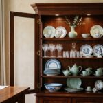
Using Architectural Features as Your Layout Anchor

Rather than hanging your pictures randomly across a blank wall, you can use an existing architectural feature, like an old door frame, decorative molding, or built-in shelving, as the anchor for your gallery wall. This approach creates a natural focal point that ties everything together in your dining room layout.
| Feature | Benefit | Visual Impact | Setup |
|---|---|---|---|
| Door frame | Defines boundaries | Dramatic framing | Surround artwork |
| Molding trim | Adds elegance | Emphasizes display | Highlights pieces |
| Built-in shelf | Creates structure | Anchors collection | Organizes display |
| Architectural detail | Unifies space | Organized appearance | Professional finish |
When you frame your art with architectural elements, the surrounding trim emphasizes each piece, drawing viewers’ eyes directly to your collection. Pair this elegant gallery wall with a simple modern round table and white neutral chairs nearby.
This unified approach, inspired by designer references like Alvhem, makes your picture wall feel well-considered and belongs perfectly within your dining space.
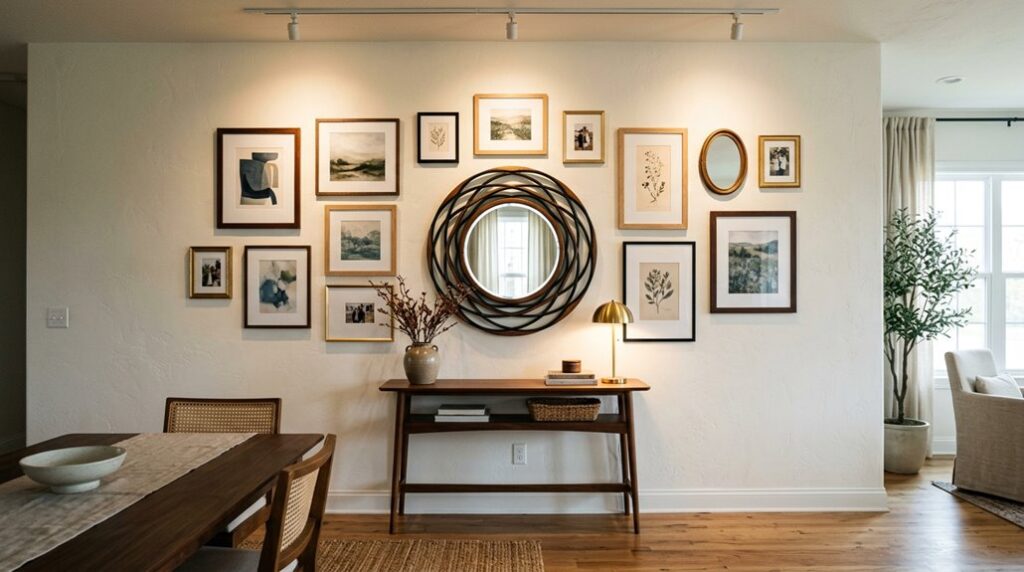
Mixing Framed Art With Shelves, Mirrors, and Sculptures

To create a dynamic picture wall, you’ll want to blend several different elements—framed photographs, floating shelves, mirrors, and sculptural pieces—rather than relying on frames alone.
This mixed approach creates an elegant, layered composition on your dining wall. Here’s how to achieve visual balance:
- Unify with finishes: Use matching frame colors like black or natural wood to connect diverse pieces and create consistency across your display.
- Add reflective surfaces: Position mirrors among framed art to bounce light around the room and prevent the wall from feeling flat or heavy.
- Incorporate dimension: Include sculptural accents that add texture and depth, breaking up rectangular frames while maintaining balanced negative space.
Floating shelves let you rotate displays seasonally without permanent damage. Consistent spacing keeps everything feeling intentional and inviting.